Reflecting on the last 4 years

Hi lads and lasses
It has been a ride. I have come so far and today I would like to reflect on my the last years. I have chosen to do the last years as Newcastle college and grafisch lyceum were equally important for my growth as a designer/ illustrator.

Grafisch lyceum Rotterdam:
In 2016 I was lucky enough to be accepted on grafisch lyceum Rotterdam. In this first year, I was able to learn a lot about the needed equipment for a designer and how the field works. I also got a few software classes but they mostly focussed on getting to know the field.

In my second year, it was all software. This was the heaviest year at the school. The education only existed out of 3 years, and the last one was doing a year internship. The second-year i learned all my skills for Photoshop, Indesign and illustrator. Besides working on the digital software we got traditional classes where I learned to work with graphites, paints, conceptual art and printing techniques. This class, however, was given only a small part compared to my software classes.
The second-year was very stressful and I had many breakdowns. The school puts a lot of pressure on their students and that can be considered a bad thing, but I learned a lot. One can say Grafisch lyceum lives of the soul of its students.

The third-year was much more relaxed. Because of the many breakdowns, I had in the second year my whole attitude changed. I decided to never let it come so far gain, and chose my well being over anything. Getting an internship was hard. Lots of students had trouble finding one. My internship started at Chefstudio. It was a marketing and sales company located in Spijkenisse and it focussed on restaurants. The company’s goals were very interesting and I could find myself working there. The owner, on the other hand, was very corrupted. He promised things he couldn’t make true and scammed people as well. Besides doing these things, he was also very mean to the employees and this has resulted in me going to the Government to talk about his doings. (In the Netherlands you have to be licenced by the government to hire interns.) His licence then got removed and we were released early. Even though this was a stressful situation I kept my head cool and searched for a new internship. I found one at Doe Het Selfie Box and it ha been amazing ever since! I still work as a head graphic designer and they taught me many tricks in the field of design. I ould also add my knowledge and it felt good having an influence on something.
While I was doing these internships, I also followed the honours program and briding course. These classes helped me get into 4 different schools including Newcastle College.

After my graduation ceremony at Grafisch Lyceum Rotterdam, I took the leap and moved to Newcastle Upon Tyne.

Going to Newcastle was scary. I did not know Amber and Eva were also joining me until the first day of school. It was even funnier when we found out we lived in the same building! Being in a different country with different manners has been hard. Especially in the beginning. Besides understanding Georgie’s accent and the English language, The whole way of speaking to each other was different than in the Netherlands. I had to adapt to all these changes and learn how to work with them. Having tutors like David around is then very helpful.He made me feel at home and helped me get the grades that I wanted. I was able to develop new skills working with the risograph, relief printer, Stickermachine, screen printing and much more. Besides these technical skills, I finally managed to learn how to work closer to an interesting and meaningful image. I struggled a lot with creating beautiful, but meaningless artworks. This was bothering me for a while but I never knew how to change it. David and other students have been an excellent help for me! This is something I will take with me as an illustrator and like to develop further.

As only drawing cute pictures was not enough, the blog posts were also very hard. I was not used writing in academic English and had many struggles. working closer with my tutors and classmates has helped me improve my English and reflect on my own practice. This is something that took a long time for me to understand. I always knew why I would be doing something, but never knew how to reflect on that and maybe make a better decision.

Newcastle college did not only make me grow as an artist but especially as my own individual. I have found how I am here, and what is next for me. Newcastle College was able to open doors for me and create a path of my liking! The one thing I learned and value the most is to never give up. It takes something to get something and by giving it my all I hope to slowly conquer the world!

Visible Art influences in my work

Hi lads and lasses, it has been a while. 

A little over a while ago I had written artist research about WLOP. He is a Korean concept artist who works on his own webtoon and is active on social media. In the (which I will link in the reference list) I stated the following, ”I mostly admire him because of the way he uses textured brushes and colour. His paintings always look so familiar. For me, he is one of those artists that make you hear the painting. Like you have lived it.”. (Jonell,2019) 

Besides Wlop, I hope to work close to the works of Skadivore. She is based in Germany and works as a self-employed concept artist, Game artist and illustrator. She works closely with other german artist and has held multiple exhibitions before (Voß, 2019) 

When writing about her art I said the following: ” Skadivore paintings are always very realistic in terms of colour, shadow and art style, but most of the times have a very fantasy/horror touch to them. the light, shadows and objects are as you would expect in the real world, but the story in her drawing is everything but realistic.”(Jonell,2019)

It has been a while when I created these post and I would like to reflect back on them and how they influenced my works so far. 

Wlop and Skadivore actually have a lot in common. It is hard to see directly as wlop is very sketch forward in her drawings but they colour the same. As WLOP starts working in grayscale, and then adjust the colour levels to create a base, so does Skadivore. However, Skadivore starts off with a one colour drawing and very quickly adds more neon colours to spice things up. Besides use in colour, they are both very skilled when it comes to light and shadow. They both have experience in 3d models and sometimes use them to determine certain qualities of colour and composition. 

As you can see here, there is a clear trace of skadivore and wlop. They are artists I look very much up too, and that is visible. 

Another example I have of my art, where both artists influences are visible is the following piece: 

I have stuck to the same kind of painting WLOP would and has tried the impossible colours that are closer to Skadivore. The face is much more detailed and actually is closer to skadivore than it would be to WLOP. However, the environment and background are definitely WLOP his style. 

I did want to give it my own turn as well. I have always felt very confident in the way I paint hair, and so I also included this in this art piece.

I have noticed that when it comes to digital painting, I am very influenced by these two. Whenever I am working on something traditional or even sculpting, I tend to still be searching for the right artist. I expect different qualities from each art medium. I think this has resulted in also wanting different artists for each art supply. I wonder if this is a shallow way of thinking? 

To put this all together, the works of WLOP and Skadivore are clearly visible in my art. Even though i can relate tho some of their older works, both artists are still evolving them selfs today. Wlop has actually moved from doing only concept art to working with 3d render models and creating working videos. He has come a long way and is now teaching others for a small Patreon fee. Skadivore is currently practising more environment art and also painting from the iPad instead of the Wacom Cintiq tablets. She also sells her personal procreate brushes on Patreon. 

Stay hungry, Stay foolish. (Jobs, 2011)

references

Voß, Pauline. (2019). n.k [Digital Illustration]. Instagram, s.l. Available at: https://www.instagram.com/p/B2UmqTnoliZ/ (Accessed: 4-6-2018)

Torres, J.( 2019.) Wlop [Blog], WordPress, Newcastle Upon Tyne. Available at: https://wordpress.com/block-editor/post/jonelltorres.wordpress.com/582 (Accesssed: 04-06-2020)

Strauss, V (2011). “Steve Jobs told students: ‘Stay hungry. Stay foolish.'”The Washington Post [Article in indonasia] The Washington Post, Washington. Available at: https://www.washingtonpost.com/blogs/answer-sheet/post/steve-jobs-told-students-stay-hungry-stay-foolish/2011/10/05/gIQA1qVjOL_blog.html?noredirect=on (Accessed: 04-06-2020)

Story time: Portfolio Evaluation

hi, lads and lasses Welcome back! Today i am going to write an evaluation of what I think of my portfolio!

It was 15th of May. The weather was great. The sun was shining and there was barely any wind. Children were playing and I and my friends were going to the beach. And then I woke up. 8 o’clock. I wanted to snooze but I could not. the deadline was to close. This was just going to be another day of soul-sucking working on that portfolio. ‘Alright’ i said to myself. ‘you did this. You could have started sooner but you didn’t.’, ‘get out!’.

Working on my portfolio was very tired some. I wanted to include so much that it became hard to do everything. due to all the other projects I had no love left for my portfolio and needed to do most of it in a very short time period. I still had big plans for my portfolio and was determined to make it amazing and everything I wanted it to be.

It took me days of hard work, no sleep and lots of junk food to complete the book! you are probably wondering how it looks? Well……

Before I show you, I will break down what steps I took to make it all happen!

So first of I started with gathering a much quality artwork that I thought would be great to show in my portfolio.

Besides using digital artworks I needed to look through all my sketchbook and filter them. The ones I wanted to use needed to be professionally scanned so I could use them in the book.

I then created a section of each. Catagories one can say. I made sure there was evidence of conceptualisation, experimentation, different art styles, creating assets focused works, pattens and line arts. even though realism is not much used today I did include that as I wanted to show a broad range of skills.

When everything I needed was gathered and organised into subfiles, I could get started on the index.

To do this I took a pen, paper and scissor. I wrote down every category and cut them out into paper bits. then I rearranged all of the papers until I was satisfied with the layout.

the next step I took was going to InDesign and picking a format. Here I started to paste every image down.

Just the images were boring so I cut up many illustrations into parts and rearranged them in my portfolio book to create a more interesting composition which fitted the goals of professional presentation.

With every new page, I made sure to ask feedback of someone so I knew I wasn’t forgetting anything. This also helps to not get too caught up in your process and make issue visible you did not notice before.

Here is a link to my digital portfolio booklet! Once the ook gets in I will be sure to review it! (Although this may be end June. Better late than never right!)

https://jonelltorresportfolio.wordpress.com/

Reflecting using STARR

Hi lads and lasses, it has been so long since I posted something. well ya, let’s cut to the case. Today I am going to write a reflection. I will discuss how I handled a very, very annoying problem. I have chosen to use the STARR method for this matter. 

STARR Reflection Method – Travellers Blog
(Bakker, 2016) (Figure 1)

Situation:

Yes, I have finally made it. After lots of blood, sweat and tears I was finally done with my portfolio booklet. It took my days if it was not weeks for me to finish it. Before I send it to a professional print company, I wanted to make sure everything is fine and make 1 last test print. Just in case. What happened next was unpredicted (and actually a clumsy) mistake. one of the images I had put in there changed colours dramatically. It wants to form a midnight purple, to an ink dark blue! 

Task

My task in this problem was to find out why this happened. After many struggles and tests, I realised it was because I drew the image in an RGB colour platform, and not on a CMYK platform. 

Action

SO my next step was to convert it to CMYK and print it again. Did not work. Colours did not change. I then looked up on google and someone recommended me a site where they change colours to CMYK online. I did and the result was horrible. even worse than the original print. there was only one step left to take……. Redraw the whole thing. HOWEVER I had a very tight schedule due to the print shop shipping time, and I went for the next best thing. Acceptance. 

Result

IT was not a horrible blue colour actually. It was kind of cool and lucky enough it fitted the concept. I do like it more Purple but that is a choice I have made. The book looks great and I am still very pleased with the result

Reflection

Looking back on this, I can clearly see 2 points where it all went wrong. A. I should have checked in what colour platform I was working on. B. I did not plan my time well and ended up with no room for mistakes. 

I learned from this experience. It is like having a good trauma. From now on, whenever I am working digitally, I make sure the colour settings are right. I also take more time for my projects. To you know…. not try to panic halfway through thinking everything is against you while I should have just paid more attention and manage my time. 

See you next time!

  1. Bakker, D. (2016) STARR Reflection Method[Blog post] Daphne Bakker Blog WordPress, Sydney, Australia.available at: (https://i0.wp.com/www.une.edu.au/__data/assets/image/0017/9530/starr-framework.JPG?zoom=2 (Accessed: 01-06-2020)

About the Kolbs Cycle…

Hi lads and lasses. Today I would like to discuss the Kolb cycle with you. As you may tell from my previous posts I am not the biggest fan when it comes to this particular reflective method. Instead, I am way more font of the SWOT method, STARR method or simply just evaluating my process. 

Reflecting can be done in many ways. It is something that should fit a person, I feel. For me to understand the Kolb cycle I have invested my time into varies blog posts, videos and articles about this method of reflection. 

I started all with a video uploaded on youtube by Cheryl Reynolds in 2013. In my latest SWOT post, I have said I would use her video to help me better understand the Kolbs cycle. She started off explaining the very basics of the cycle and how it got where it is now. She also explained who David Kolbs was. At the end of the video, she asked if I thought this way of reflecting is helpful and if I will use it in my next task. When she said that I started to wonder. I never really liked reflecting this way. Is it just a matter of not understanding well enough? Or do I just really think it is not for me? (Figure 4)

To further, develop a legitimate opinion I have read the following article by Vinukonda Parthasarathy. He is a design professional who creates optimal learning solutions for various customers requirements. He also has +17 years of experience in the learning industry. ”He works closely with L&D teams to understand their learning and training needs and propose optimal learning solutions to enhance employees’ performance. He is the Head of ID at Tesseract Learning.” (Elearning industry, 2018) These are the 4 steps of Kolb’s cycle:

  1. Concrete Experience
  2. Reflective Observation
  3. Active Experimentation
  4. Abstract Conceptualisation

What I liked about his article is that he used an example throughout the explanation of the cycle. However, his example was 1 or 2 sentences big. What he wrote did make sense, however, when having to create a bigger writing piece it did not make sense to me anymore. This is where I have been struggling.  (2018) (figure 1)

Another article discussed the relevance of Kolb’s reflective cycle nowadays. The writer of the article, Laura, explained that when looking at the AGES (Attention, Generation, Emotion and Spacing) design module, kolbs cycle inherited them all. 

”The suggestion is that learning (and specifically retention) is enhanced when:

  • The learner gives focused attention to the learning
  • The learner generates multiple connections between the new learning and existing cognitive maps and prior experiences, seeking out relevance
  • The learning has a base in emotion, as heightened emotion is connected to memorable and powerful learning
  • The learning is appropriately spaced and in manageable amounts, allowing the learner ‘time-out’ from the learning and chances to come back to it time and time again to review and assimilate it.”

Laura concluded that ”It could be argued that trainers are simply jumping on the bandwagon of ‘neuroscience’ and, as many have done before, providing a glossy new spin on something that is popular, easy to grasp and lacking in scientific rigour. Maybe the new approaches to learning will be as laughable as some of the learning style models of the 1980s seem today. Or maybe we keep coming back to simple models like the Kolb Experiential Learning Cycle because, despite the fact we can’t ‘prove’ that they work, they offer learners powerful new insights into their day to day experience and the door to a better understanding of their own actions and responses.” (Laura, 2017) (figure 3)

Even though I have trouble completing the Kolbs cycle method, I do agree on what she says. Many reflective methods help me get inside in what I am ding. Does that mean I should follow the kolbs cycle anyway even though my differences? I think not. The whole purpose of this cycle is for me to better understand my own process. If the kolbs cycle can not give me that, then maybe trying other methods are better for me! 

Refrences

  1. Anon. (2018) vinukonda parthasarathy [Profile] Elearning Industry, s.l. Available at: https://elearningindustry.com/elearning-authors/partha-sarathy-vinukonda (Accessed: 01-06-2020)

2. Parthasarathy, V. (2018) Using Kolb’s Learning Styles To Create Engaging Custom eLearning Courses [Artcile] Elearning Industry, s.l. Available at: https://elearningindustry.com/using-kolbs-learning-styles-engaging-custom-elearning-courses(Accessed: 01-06-2020)

3. Laura. (2017) Is the Kolbs Experimental LEarning Cycle still relevant in this age of instant information? [Artcile] Elearning Industry, s.l. Available at: https://elearningindustry.com/using-kolbs-learning-styles-engaging-custom-elearning-courses(Accessed: 01-06-2020)

4. Reynolds, C.(2013) The 3 minute Kolb [Video] Youtube, s.l. Available at: https://www.youtube.com/watch?v=ObQ2DheGOKA (Accessed: 1-06-2020)

Hi-Fructose magazine review!

Hi lads and lasses. It has been a while. for today’s post, I will review the current latest edition of the hi fructose magazine. As stated on their Facebook page ”Hi-Fructose The New Contemporary Art Magazine is a quarterly print art magazine, founded in 2005.” (Hi-Fructose,2005) In this magazine, you can find some of the best surrealism and contemporary artworks made by popular and also an unpopular artist. Many of the artworks are also focussed on current economic issues and problems. This makes it very interesting to see some of the created artworks. Besides addressing current issues, some artworks also lean towards more of a taboo situation. In this review, I would like to explain my opinion on certain artworks and end with a general idea of what I think of this magazine.

This specific hi fructose volume includes works such as ”the paintings of Eunjeong Choi, the paintings of Riika Sormunen, a retrospective on the art and life of Eyvind Earle, the narrative quilts of Bisa Butler, the geometric B-Boy sculptures of Taku Obata, the dense digital collages of Luis Toledo, cover artist Mitsuru Watanabe’s take on classic paintings, the figurative paintings of Kati Heck, and a review on a new documentary on special effects legend Phil Tippett! Plus: a 16-page insert on the drawings of Ozabu printed on fine toothy paper, and more” 1.(Smith,2019)

The magazine starts with a series of very colourful artworks by Eunjeong Choi. She is a Korean artist currently mastering here PhD in painting at Hong Ik University. Her creative and illusionary oil-painting show the growth of a bonsai plant. Choi says, ”When viewing my artwork, one gets to enter the scene, and then the images come out, wriggling and screaming. Such space is not a utopia where nature human beings, objects and concepts are in harmony. Instead, it’s the Heterotopias, where many objects are mixed up together and cannot be clearly distinguished or defined.”(Hi-fructose, 2019).  

2.(Owens,2020)

When reviewing the artwork it does not look at all like a bonsai tree. However, it does give me the feeling of a tree or forest. When inspecting the different textures used I now understand why it feels like a forest. The long vertical strokes feel as tress. The wavy brush texture with lots of colours and high contrast create the feeling of a forest. the rainbow passing through the bottom of the painting references for me to a river passing through the woods. I can also see the circle on the background as an indication of sunlight passing outwards. In my opinion, the use of negative space in this artwork strengthens the illusion of a specific part in the woods. Because there is so much going on within the artwork, the gap between the so said sunlight and the forest create a moment of peace for your eyes without losing sight of the artwork. I find it very fascinating how the painting is brought back to the minimal where I can still understand what is going on without the loss of depth and colour. Even though some parts are very hard to lay eyes on due to the intensity of patterns and colour it still represents a clear image. 

As she also talked about showing the growth of the bonsai tree I can also see how the circle at the back of the painting reference to its lifeline.  

When searching through her Instagram I found another painting of a bonsai tree from the same series. 

3. (Owens, 2020)

The second artwork that took my interest was from Eyvind Earl, titled ‘Uncanny Valley’ This is an artwork created with oil-paint. The reason I picked this artwork is that it reminded me of a lot of Disney’s sleeping beauty movie from- 1959. He is also known for helping create concepts for LAdy and the tramp and Peter pan. I have made a post before describing my interest and liking of this art style. Upon further investigation, Eyvind Earl was actually the lead stylist for this movie. The Uncanny Valley series otherwise known as the valley of dreams is a series dedicated to nature and perceiving it in a more looney toons way. His art style has influenced the works of Mike Giaimo and Mike Gabriel who then created the designs for Disney’s Pocahontas. 

4. (Jovíc, 2015)

In this painting, you can clearly see the influences he has had on the style of Sleeping beauty. The square trees and the early morning skies give you that authentic feeling. The use of many lines and more saturated colours help create the vintage look. I found his style to look very royal. it reminds me of a fairy tale art style. His ability to tell stories with his artwork is also outstanding. 

Hi-fructose has allowed me to be inspired by more different artists then what I would usually look for. I have seen some greats works that I could really appreciate and some works that just were not my thing. And that’s okay. I would definitely recommend buying a Hi-fructose magazine and just look through it. I was very pleased to find out this edition of hi-fructose features a stylist of one of my all-time favourite movies. Most of the times I mentioned Walt Disney and art together there is always a form of judgement. Just like when people say they draw anime. It is not like I do not understand but a lot of Disney classics have changed and decided the course of current animation movies. As an illustrator, the art of these Disney movies has inspired me to create my own works. I do not believe it is wrong to appreciate and like to work Disney has put out. But that’s for another blog post!

References:

1.Smith, Andy. (2019) Hi-Fructose Vol. 54 Preview![website] Hi-Fructose,s.l, Available at: https://hifructose.com/2019/12/10/hi-fructose-vol-54-preview/[Accessed on: 12-04-2020]

2.Owens, A. (ed.) (2020) HI-Fructose!, Volume 54

3.Owens, A. (ed.) (2020) ‘Uncanny Valley Eyvind Earle’, Varoom, Volume 54, pp. 51

4.Jović, M. (2015). Influences of European Art on Walt Disney’s Animated Features (Doctoral dissertation, University of Zadar. Department of English, Available at:https://repozitorij.unizd.hr/islandora/object/unizd:427 (Accessed at: 12-04-2020)

Skadivore

Concepts
Pauline Voß (mostly known as Skadivore) is a German Digital artist. She is known for her art on Instagram. Her art is always a bit dark, sexual, witchy and fantasy. Skadivore has influenced me a lot with the way she uses colours and light. She really knows how to set a mood in a painting. When working on my own ideas, her art helps me to give mine the desired mood through colours.

Visuals

Skadivore paintings are always very realistic in terms of colour, shadow and art style, but most of the times have a very fantasy/horror touch to them. the light, shadows and objects are as you would expect in the real world, but the story in her drawing is everything but realistic.

Skadivore’s artworks are very dark but also very colourfull. She uses a lot of neon-like colours to represent light. This makes the painting a whole lot more interesting.
You can clearly tell she likes to work with the value of colours.

Skadivore helps me to understand how to use vibrant colours to sketch a mood in my paintings. Also how the value of colour works and how to highlight is created.

figure 1

Techniques/ Production:
Skadivore uses an iPad pro and pro pencil to draw with. She uses a very popular app called procreate. She also follows life drawing workshops and references when creating an image. Skadivore (like many others) customized her own set of brushes on procreate.

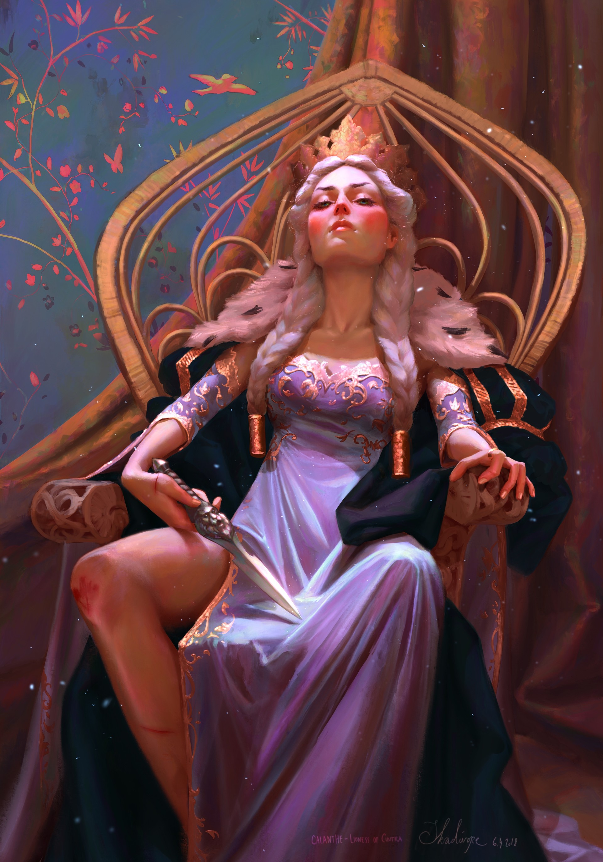
For this piece, I think she used a reference for the pose and chair. it is very accurate and that’s why I think its to hard to draw that out of memory.
The way skadivor uses colour in her drawings is fascinating to me. when working on my ideas, I like to also use colours the way she does and work with that same kind of lighting.

figure 2


Composition:
In Skadivore her artwork she applied the rule of third by filling in the right side of the drawing with the main character and using her hand as the second point of interest. her face is now on the opposite side of her hand which creates a balance between the two. Her body is also almost perfectly divided into three sections.

My attention is drawn to her hip because the shattered light spectrum is pointing that way. My eyes then move up to her face and because she is looking down I follow her to her hand. She is trying to do something with her hand and that is interesting.
the painting is made up by the smokey/cloudy background, the girl as mid-ground and the light spectrum as foreground. To create more depth skadivore uses light.

figure 3

Skadivore has an amazing colour palet. Her works always know how to concey a feeling. I adore the way she uses light and i try to implement this in my own art a lot. In myopinion it make smy art more believable and easier for they eye. It make smy art more lively!

Refrences:

1.Voß, Pauline. (2018). n.k [Digital Illustration]. Instagram, s.l. Available at: https://www.instagram.com/p/BnIGzmUANgo/?igshid=1ou49zfcq473f (Accessed: 3-10-2018)

2.Voß, Pauline. (2019). Calanthe – Lioness Of Cintra [Digital Illustration]. Art Station, s.l. Available at: https://www.artstation. com/artwork/dd0dW (Accessed: 3-10-2018)

3.Voß, Pauline. (2018). n.k [Digital Illustration]. Instagram, s.l. Available at: https://www.instagram.com/p/BkQuIVqhdxJ/?igshid=3mn2rt014i3z (Accessed: 3-10-2018)

4.Voß, Pauline. (2018). n.k [Digital Illustration]. Instagram, s.l. Available at: https://www.instagram.com/p/BnIGHkegOGk/?igshid=jic7srcvnzuq (Accessed: 3-10-2018)

the (in)importance of a logo

Hi lads and lasses and welcome back to my blog. Today we are going to dive into a more graphic design side of me, rather than illustration. As you may be aware, Before coming to Newcastle College, I have invested my time following Graphic designer education with as specialism Visualisation. I have learned a lot about graphic design and how to make a brand stand. In my second year, I had the chance to further developing myself as a visual designer. I started looking at the worth of logos in a company. I always found this topic rather interesting and today would love to discuss it with you. I would like to start off by reviewing a youtube video titled: ”What makes a truly great logo” by Vox and share my opinions about this.

Vox is a youtube channel who helps people ”cut through the noise and understand what’s driving events in the headlines and in our lives.”(Vox, 2014) Vox exists out of around 25 people and has close to 2 million subscribers. Besides Youtube, they are also active on Instagram, Twitter and have their own website. Vox was founded back in 2014 by Melissa Bell and Ezra Klein. 

On the 28 of December 2015, Vox uploaded the video: ‘What makes a truly great logo’. In this video, Joe Posner interviewed Michael Bierut (designer of the Hillary Clinton campaign). The video starts with an introduction and a statement from Bierut; Logo’s are often overrated. As an example, he takes the Swastika logo. ”Some are beloved, some… the swastika is a logo and it’s reviled.” As a fellow graphic designer, I think to understand what he means. People are fast under the impression a logo has to be perfect to work. In some occasions yes, but most of the time its the product or the company that makes the logo valuable and interesting. 

The video continues With Joe Posner explaining the 3 different types of logos:

  1. The wordmark. This kind of logo is what we all know. These logos exist only out of a word with a specific decorative or serif font. Almost no decorations or illustrations are used to support the brand. Good examples are: Disney, Coca-cola, Samsung, FedEx, DHL, vans.
  2.  The second logotype is Pictoral. ”Pictoral logos often function as a kind of rebus. It’s a picture, and it’s identifying the name of the company. sometimes directly like Target. Sometimes indirectly like LaCoste.”(Bierut, 2015)
  3. Joe Posner continues to explain the third category: Abstract Iconography. It is somewhat like the ‘holy grill’ (Posner, 2015). This selection of logos is more abstract. You can almost not tell how the logo is related to the product or service in a way. It is an actually thinker. ”It’s everyone’s favourite kind of category because it just seems almost like magic.”(Bierut, 2015). An example given by Bierut is the Nike logo. The founders of Nike had their logo commissioned and they actually did not really like it that much at the start. However, over time, they started to relate their products towards athletic achievements and so their logo grew together with the company. 

Bierut believe that religious symbols work the exact same as the Nike logo! ”It’s obviously not just anything inherent about these shapes, but what these shapes have come to represent in the minds of the people who are looking at them” 

4.It does not stop here. There is a 4th logo category: The logo system. This form of logotype is constantly changing. This means it can change in anything, as long as the original logo is still to be recognized. This is a modern approach. Bierut continues to explain that back in the earlier days, putting a logo on something was not as simple as it is now. Once it was on something it took a lot of effort to change. Therefore enforcing that the 4th logotype is a modern approach. 

”It really is about thinking of these symbols as being empty vessels in a way. And then you pour the meaning into them” (Bierut, 2015)

Posner and Bierut then conclude that a good logo is not about how well it scores in discussions but just how long it will stand. 

I found it very interesting to listen to a professional Graphic designer and his statement. It was very bold, but also promising. I do agree with what Micheal Bierut said. As times are changing so are our ways around logos. A promising logo is not something different and special, but filled with meaning and long-lasting lifetime!

I will soon start to begin a logo design for my own business and will take all of these lessons with me. This video will influence the choices I will make when working on my logo.

References:

Posner, J. (2015) Vox: What makes a truly great logo  Youtube, s.l. Available at: https://www.youtube.com/watch?v=RBTiTcHm_ac (Accessed: 15-06-2020)

Dispatched Book Review

Hi lads and lasses, Today I am going to take a look at a magazine I have ordered online. It is a collection of works from the Graphic Communication students, at Northampton University. For both my Small Fries and Cards project I need some graphical influences. This book is perfect as it focusses on sending a message with products.

I hope to get some new inspiration for my upcoming projects and maybe even some enlightenment on a good layout! This magazine shows only pictures and does not include any texts whatsoever.

The first artist that drew my attention was Ellie wiles.

figure 1

Her designs are among one of the first. I adore the layout she has created for the ‘Oh Crumbs’ book. the limited sweet and soft colour palette works extremely well with the subject she chose. the spacing between the text frames is also well thought through. I would like to interpret some of her choices in my own work as I think it fits my project well.

Another artwork that stung me was the penguin book cover award by Laura Cook. She has created a pattern of roses. Instead of only repeating the same drawing over and over again, she created multiple versions of the same illustrations and created a pattern like that. In my opinion, she worked this out very clever as it does not get boring as quick ad only repeating 1 draw would have been.

figure 2

As I am working on doing ‘Empty’ greeting cards where people can write down personal messages, A background like this can work well. I want to further look at these kinds of patterns and will include this style in my card research.

Precious Ayebola, created a mock-up file for her design of the penguin book awards. Even though I am not that fond of the book design, the whole mock-up really fits the book cover well and it makes it stand out more than it would have alone. As I am focussing on making my products sell, including backgrounds with my designs can help make the product more attractive. I hope to further involve this method of presentation in my own work.

figure 3

Besides the works I have just mentioned, there were also many others in this book that spoke to me. I have filtered these images below.

Refrences:

Wong, T., Black, J., Clouder, J.L., Wiles, E., Deegan, B., Boddington, K.,(2018) Dispatched. 1th Edn. Northampton: Alpha pallets. (Accessed:13-3-2020)

  1. Wiles, E. (2018) Dispatched. 1th Edn. Northampton: Alpha pallets. (Accessed:13-3-2020)

2. Cook, L. (2018) Dispatched. 1th Edn. Northampton: Alpha pallets. (Accessed:13-3-2020)

3. Ayebola, P. (2018) Dispatched. 1th Edn. Northampton: Alpha pallets. (Accessed:13-3-2020)

4. Goode, M. (2018) Dispatched. 1th Edn. Northampton: Alpha pallets. (Accessed:13-3-2020)

5. Sandberg, S. (2018) Dispatched. 1th Edn. Northampton: Alpha pallets. (Accessed:13-3-2020)

6. Ward, D. (2018) Dispatched. 1th Edn. Northampton: Alpha pallets. (Accessed:13-3-2020)

7. Scott, K. (2018) Dispatched. 1th Edn. Northampton: Alpha pallets. (Accessed:13-3-2020)

8. Henry, E. (2018) Dispatched. 1th Edn. Northampton: Alpha pallets. (Accessed:13-3-2020)